Introduction to Controls
About controls
Controls on a page allow users to interact with the web application.
In the toolbox, controls are grouped into Common, Component, and Layout categories. To add a control, drag and drop the selected control from the Control toolbox onto the layout area. The Properties list displays the properties for the selected control, part of a control, or layout. You adjust the properties to customise the control's appearance, behaviour, data interactions, and so on.
Note | When you add a new control it is not automatically selected in the Properties list; you need to select it before making changes to its properties.
Properties list
In the Properties list, properties are grouped into sections; System, Appearance, Data, Behaviour, Permission.
Particular controls will use some or all of the sections, depending on their function. The sections are outlined below.
System
The System property provides the control's Name property which is also the control Id; the name is auto-generated when you add the control but you can change it by editing the Name value. This is also the place to copy the name of a control to the clipboard for use elsewhere.
Note | Control Names (Ids) are case-sensitive; you must use the exact case when referencing a control.
Appearance
The Appearance properties define how the control will look on the page; the actual properties available vary according to the control type.
Language translation: Where a control displays text, you can apply language translations using the Translate button ![]() to the right of the text's property value. You must set up languages first for the web application version otherwise the Translate icon does not appear. For more details see Using Languages Tutorial and Configuring a Web Application Version.
to the right of the text's property value. You must set up languages first for the web application version otherwise the Translate icon does not appear. For more details see Using Languages Tutorial and Configuring a Web Application Version.
Some important properties are described below.
- Theme: You can choose a colour scheme from the drop-down list for this control. You can also create your own custom themes for controls, see Web Application Themes.
- Hidden: When you set Hidden to On, the control will be hidden when the page loads. Subsequently the control may be unhidden or hidden again using the FSI API JavaScript methods fsi.show() and fsi.hide().
- Placeholder and Label: Some controls, for example, Text Box have a default placeholder and label you can change:

The Label property appears in the Label sub-section of Appearance. - Header, Footer, Row, Legend: Mode complex controls such as Grid, Datalist, and Chart have addition sub-sections to customise their appearance.
Data
The Data properties associate a control with some data. The data source may be a data object, or typed data. Typed data is usually used to provide a default value to display in a control.
For example, you can link a Combo box control to a data object column so that the column data populates the drop-down list. Another example would be a Grid control linking to a data object and displaying all of the data object columns.
For a Label control, Data properties provide a default value for the label displayed text.
Behaviour
Behaviour properties can be used to trigger workflows, and call JavaScript functions or web services on particular events. Some examples are:
- When you enter data into a Text box control.
- When you click a Button control.
- When a Page event occurs, such as page load, scroll, resize, click, and so on.
Permission
Permission properties are used to restrict access to a particular control.
You create permissions at the application level; see Configuring a Web Application Version, and then apply them to controls on the page.
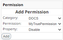
A permission applies to one or more users, and can have a value of True or False. You select a category, and a permission from that category, and then set the control's Permission Property to Disable or Hidden. Additional permissions may be added using the Add button to extend and refine the restrictions.

In this example, the permission MyTruePermission has a value of True so that the control would be disabled for all users targeted by MyTruePermission because Disable would be set True.
If the permission had a value of False, the control would not be disabled (i.e. would be enabled) for all users targeted by MyTruePermission but would be disabled for any other users.
Deleting a control
To delete a control:
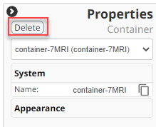
- Select the control—either by clicking it on the layout area, or by selecting it in the drop-down list.
- Click the Delete icon
 on the box that surrounds the selected control; alternatively click the Delete button at the top of the Properties list.

Language translations
Translations can be applied to a control where you see the Translate button ![]() alongside a property. For more details see Using Languages Tutorial and Configuring a Web Application Version.
alongside a property. For more details see Using Languages Tutorial and Configuring a Web Application Version.